GOV.UK have spent a substantial amount of time understanding users and recommending strategies website owners should implement to help make their websites accessible. The four basic principles are that websites should be:
- perceivable
- operable
- understandable
- robust
By focusing on the 4 principles of accessibility, not technology, the emphasis is on the need to think about the different ways that people interact with content. For example, users might:
- use a keyboard instead of a mouse
- change browser settings to make content easier to read
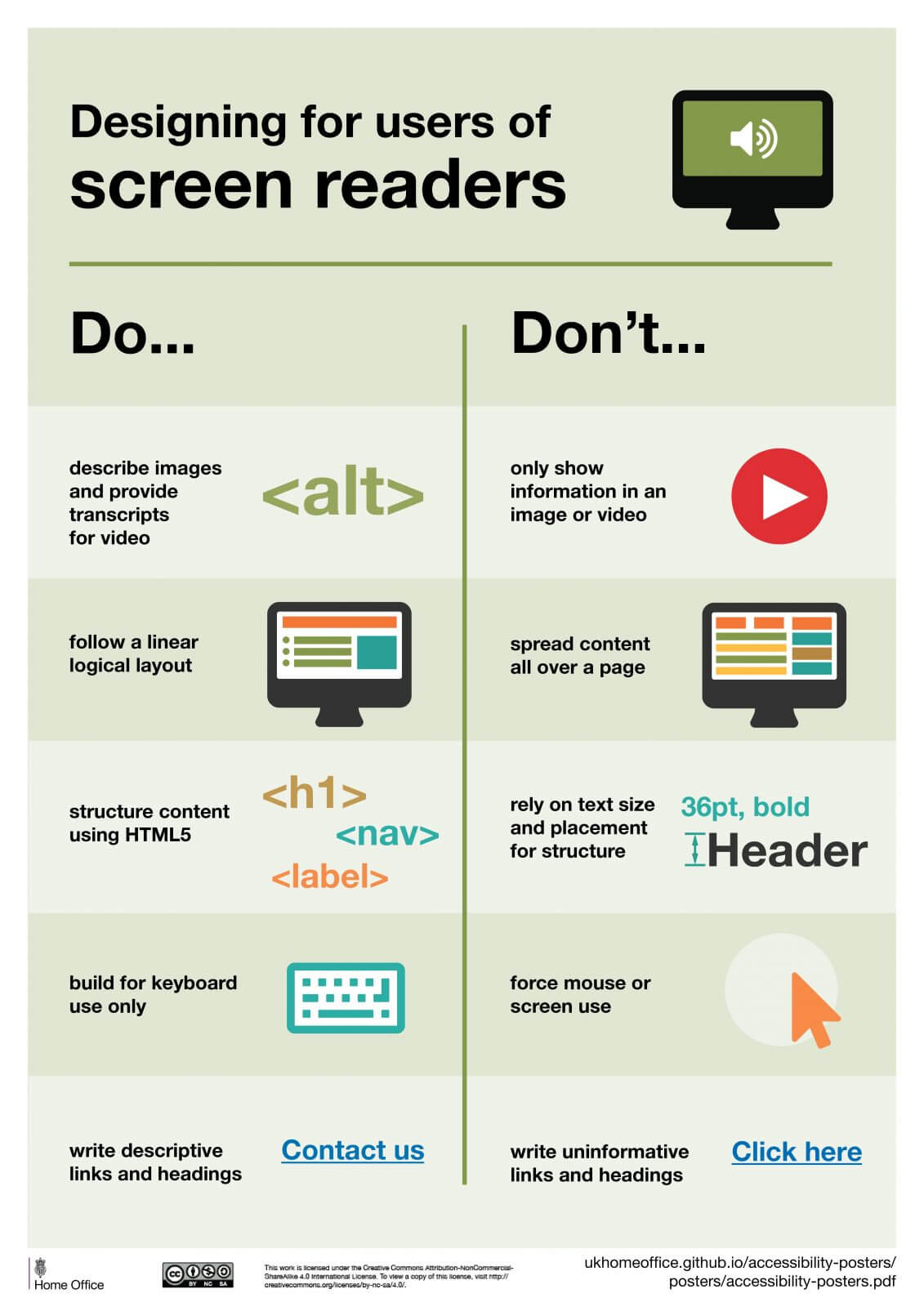
- use a screen reader to ‘read’ (speak) content out loud
- use a screen magnifier to enlarge part or all of a screen
- use voice commands to navigate a website
The principles apply to all aspects of your service (including code, content and interactions), which means all members of your team need to understand and consider them.
Below, you will find some specific ideas and suggestions for how you can make sure your content is perceivable, operable, understandable and robust.
Principle 1: Perceivable
You need to make sure users can recognise and use your service with the senses that are available to them.
This means you need to do things like:
- provide text alternatives (‘alt text’) for non-text content
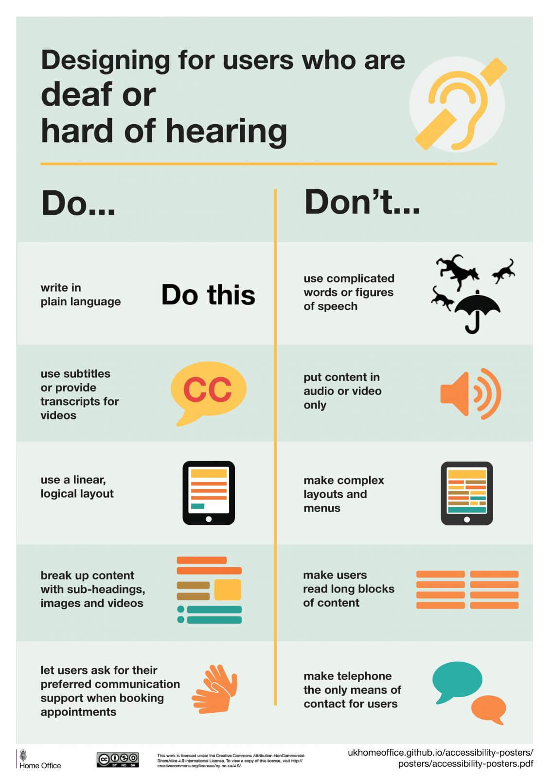
- provide transcripts for audio and video
- provide captions for video
- make sure content is structured logically and can be navigated and read by a screen reader – this also helps if stylesheets are disabled
- use the proper markup for every feature (for example, forms and data tables), so the relationships between content are defined properly
- not use colour as the only way to explain or distinguish something
- use text colours that show up clearly against the background colour
- make sure every feature can be used when text size is increased by 200% and that content reflows to a single column when it’s increased by 400%
- not use images of text
- make sure your service is responsive – for example, to the user’s device, page orientation and font size they like to use
- make sure your service works well with assistive technologies – for example, important messages are marked up in a way that screen readers know they’re important
Principle 2: Operable
You have to make sure users can find and use your content, regardless of how they choose to access it (for example, using a keyboard or voice commands).
This means you need to do things like:
- make sure everything works for keyboard-only users
- let people play, pause and stop any moving content
- not use blinking or flashing content – or let the user disable animations
- provide a ‘skip to content’ link
- use descriptive titles for pages and frames
- make sure users can move through content in a way that makes sense
- use descriptive links so users know where a link will take them, or what downloadable linked content is
- use meaningful headings and labels, making sure that any accessible labels match or closely resemble the label you’re using in the interface
- make it easy for keyboard users to see the item their keyboard or assistive technology is currently focused on – this is known as ‘active focus’
- only use things like mouse events or dynamic interactions (like swiping or pinching) when they’re strictly necessary, or let the user disable them and interact with the interface in a different way
- make it easy for users to disable and change shortcut keys
Principle 3: Understandable
You have to make sure people can understand your content and how the service works.
This means you need to do things like:
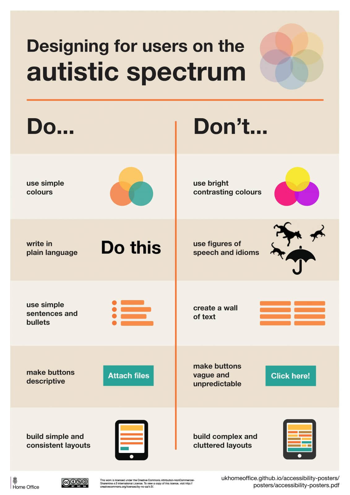
- use plain English
- keep sentences short
- not use words and phrases that people won’t recognise, or provide an explanation if you cannot avoid it
- explain all abbreviations and acronyms, unless they are well known and in common use – for example, UK, EU, VAT
- make it clear what language the content is written in, and indicate if this changes
- make sure features look consistent and behave in predictable ways
- make sure all form fields have visible and meaningful labels, and that they’re marked up properly
- make it easy for people to identify and correct errors in forms – you can find the best practice for form design in the GOV.UK Design System
Principle 4: Robust
You must make sure your content can be interpreted reliably by a wide variety of user agents (including reasonably outdated, current and anticipated browsers, and assistive technologies).
This means you need to do things like:
- use valid HTML so user agents, including assistive technologies, can accurately interpret and parse content
- make sure your code lets assistive technologies know what every user interface component is for, what state it’s currently in and if it changes
- make sure important status messages or modal dialogues are marked up in a way that informs users of their presence and purpose, and lets them interact with them using their assistive technology
- lets the user return to what they were doing after they’ve interacted with the status message or modal input
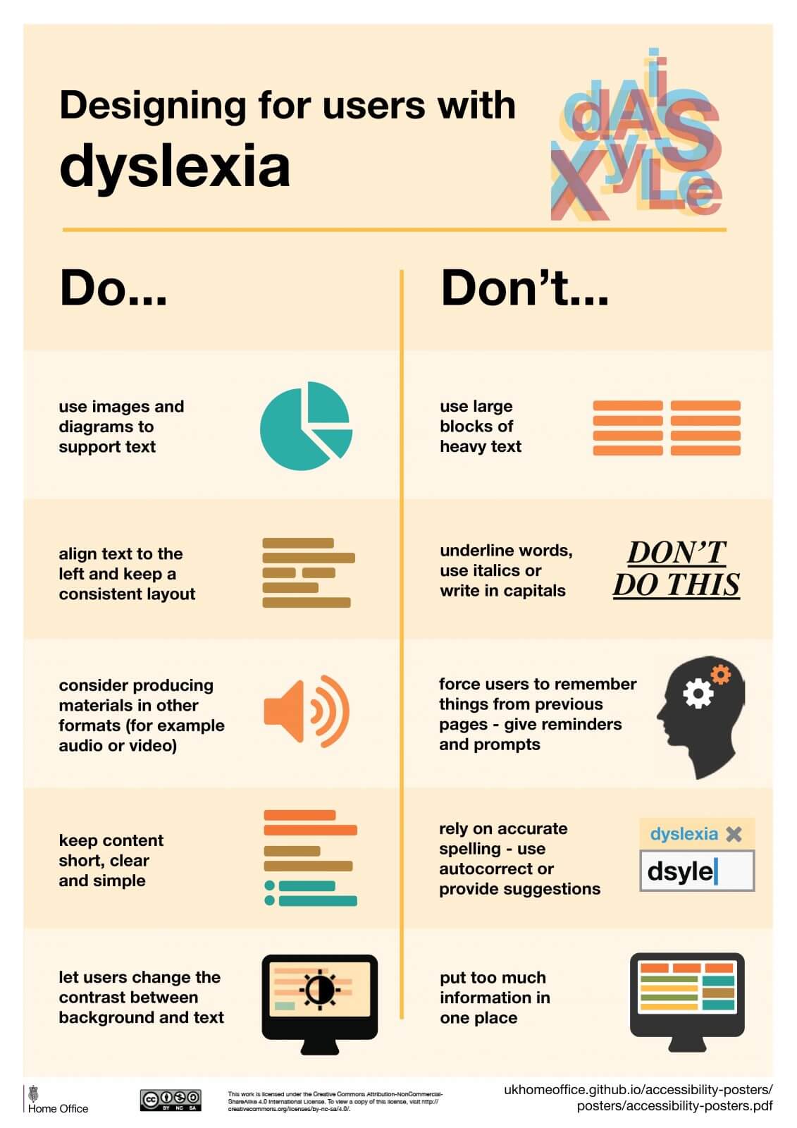
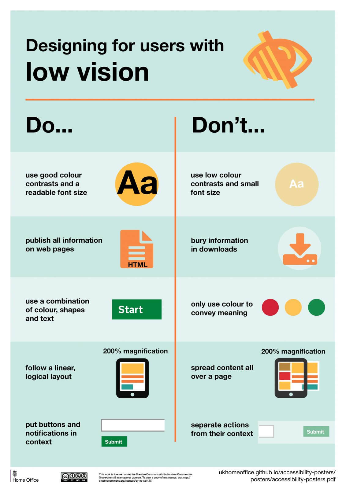
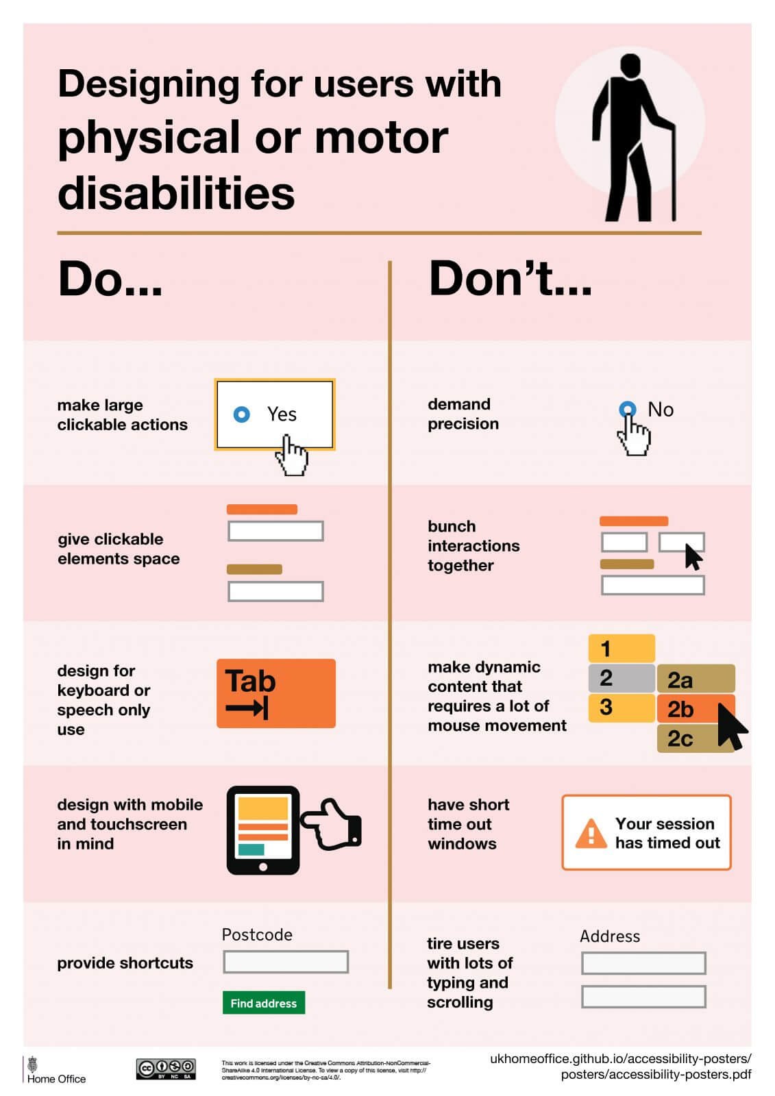
Posters
Documents
Original author / source: GOV.UK